Lords of Illic
Dismissing the Dismiss Button
Today is the last day of my break. Or at least that is how the entry originally began. A full week has passed since then. What originally was supposed to be an announcement about the new patch for my game became philosophical - a bad (or perhaps good?) habit of mine. Either way I was back to work this week and while I did make more progress on Illic this weekend the build is not quite there. I still however want to finish this blog post and show some previews of the next build.
During my week off I managed to finish off a couple of things - some of them were even games! I played Hades, Unpacking, Rooftop Renegade to completion. The second two are quite short (to finish all of their levels anyway) but the first was a game I have been obsessed with for months. I had actually reached the epilogue before my week off began, but I wanted to get every single power-up so I did more runs. Since then I have also finished pokemon I started at the end of the year and played some hours of a game called Void Terrarium. I mention them not because I have been slacking off on Illic because each one was good and gave me an idea for a game. I’d love to combine Pokemon, Void Terrarium and Hades into an evolution focused rogue-lite game. Unpacking makes me want to make a picturesque puzzle game which is also like a picture book. Finally I’d love to combine Ori and the Blind Forest with Rooftop Renegade with a splash of Donkey Kong.
I can hear a voice in my mind which says:
“If you started a new game you could do better.”
Which in turn makes me think about how much more progress I would have made if I had ditched Lords of Illic and started to work on a different game. Other than just being able to design everything better from the ground up (with way more tests), I could get feedback earlier in the cycle so I could hone into important things quicker. I could avoid pitfalls and importantly I could reduce the amount of time designing UI. So did I boldly start working on the new game? No, of course not. I have been working on implementing the feedback I received. If Illic isn’t fun or it isn’t exciting, I just need to figure out how to make it exciting. It needs a better user experience so it will get one. I am determined to stick with Illic until it is a game I am satisfied with, no matter how long that takes (thank god that I don’t have my life and livelihood riding on it).
I started my week off with a big list of issues generated by the advice I had received and so I got to work on making things better. Most likely left to my own devices I would have messed around with the code in attempts to reduce coupling and be able to implement new features (which I would then not take the time to fully flesh out in my game). Instead with the obvious flaws pointed out to me, I got to work on more pressing issues. The first target was the UI. I started to reduce the brightness of a number of the elements, which was something I couldn’t help but notice when other flaws in the UI were pointed out. One of the biggest and most obvious victories when fighting against the bad UI design was those pesky bottom of the UI dismiss buttons. I have always hated those buttons. They have always taken up too much screen space, been annoyingly far away and generally just looked out of place. Why did I put them there in the first place? It is a bit hazy since it was years ago when I first created my custom UI panels and so but… I believe the reason was that I couldn’t get a nice look on having a cross in the corner of my panels. So instead of spending more time on it… I made something just as ugly if not more? If you are making the game just for yourself it is only easier to torture every player in the game with bad UX design…

It was at this point the blog entry went off the rails and started to delve into analysing why Illic had ended up how it did. Which I think is a great but not on topic for this blog entry. Read it here: https://itch.io/blog/543163/how-did-it-come-to-this-in-the-first-place if you are interested.
The next thing on the chopping block was (most) hold times. Now the reason for them is simple. A different piece of bad UX design - which was warping the mouse cursor to UI elements. Another thing I hate in games that I shoved in for poorly thought out reasons. It existed to try to fix a problem I had with UI elements appearing under you and you clicking them as they appear. So the warp was a bandaid for that problem but ah… it never worked as that so I made the hold times as the warping only made the bad clicks worse. Anyway, the moral of the story is… fix the actual problem. Alongside that I have added in more button shortcuts and removed duplicate placements for buttons. On reflection I think there is no point in clogging up menus with more time consuming ways of ending their turns. Finally I am planning on making it so the buttons show their progress indicators when a button for the same control is pressed. Which is not finished which along with a glitch is the main reason the build isn’t ready yet. While I was at it I threw away all the confirmation dialogues except for deleting your save data.
Another great suggestion was to have tooltips on buttons, but at the same time I already had that but I turned them off because… well tooltips popping up on buttons all the time is annoying. Except… sometimes you still need them. As soon as I started to think about it though, there was a simple solution. What if the tooltips just had a delay on them? Ah but the tooltip system was an ancient relic barely touched through development! Since it has worked (well enough maybe) and it didn’t have many dependencies I had left it alone all this time. Which also made it very easy to rewrite. So I rewrote the tooltips to be better in all ways.
Staying with UI I also redid a lot of sprites on my sprite-sheet so instead of having a completely black border they will use a darker version of their own tint. Which in turn caused me to revisit what is on each sheet. I had a terrible way of packing my sprites (randomly) which since I have a sheet for each control type, I had random other sprites on the sheet. Causing a lot of duplicated sprites. Which in turn led me to working on the tip menu as I responded to critique about crowded menus. So now you can look at any tip you want when and if you want through a battle scene tip menu.
I have also started to lay the groundwork for better tile models (and I have updated the existing models a bit). I need to still do a bit more work since I have a system where you tint the bases of tiles to reuse them in different tilesets. I realise now I should have separate base and top prefabs and that is still on my todo list.
I also revamped the main menu and well the list goes on. Not everything is super exciting but it felt great actually nailing down some floating issues that I have not felt were important. (Maybe in relation to the game being mostly broken they were not). Either way every time I fix something I can feel like just the act of noticing and actually fixing them will help me not make the same mistakes in the future so when I am ready to move on I will be able to do so with pride and much better skills under my belt.
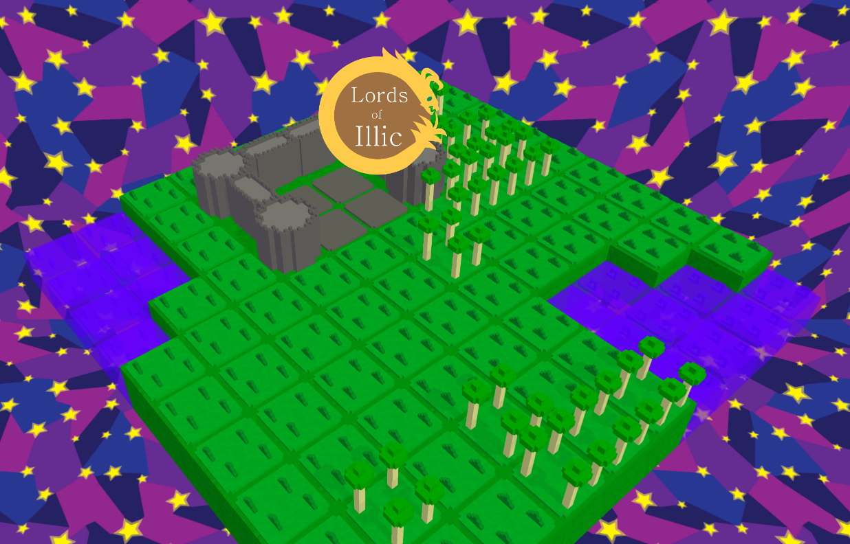
You can see the level in the menu before you press any key - there is also a preview of the new tile textures which I am not satisfied with.
A new build is on the horizon with these new features, once I feel like they are ready. Which will have to be soon as I realise that AVCON is fast approaching.
Thanks for taking the time to read this and remember this;
“You know what I always say”.
Leave a comment
Log in with itch.io to leave a comment.