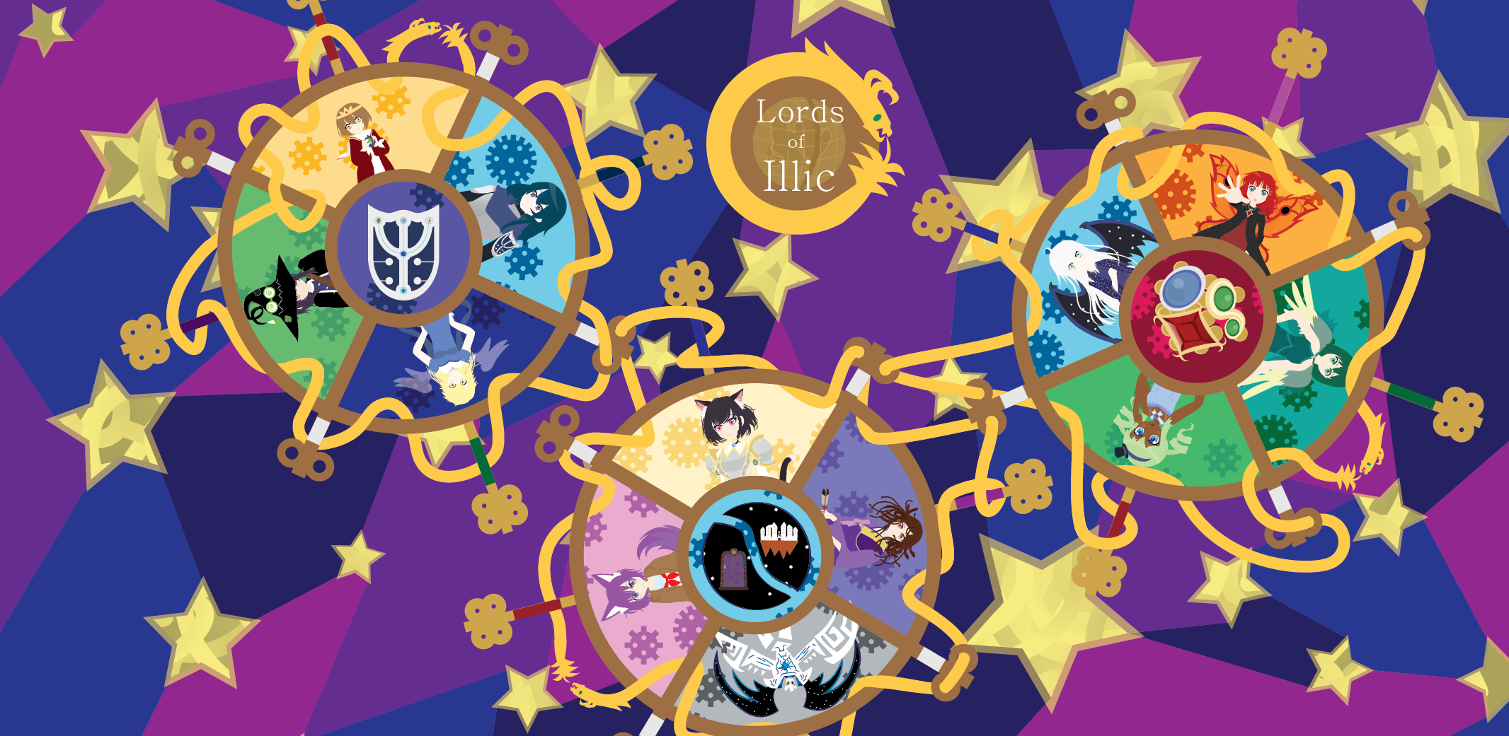
Lords of Illic
Art Style in Illic
Since I have been talking about TDD for the last two entries, I was going to follow up with a third entry on the topic. I think that can wait a week or two because this weekend I decided to work on some character art. Why? For months and months as Avcon approached I have mentioned I want to add in a splash screen of the character when using their ability charge. It is something fun and lighter to work on in comparison to desperately working on getting a demo ready. Something to recharge my batteries after the trials and tribulations of life lately. One reason I have stuck with Illic for so long is when I get to feeling sick of working on one part of the game there are always other things I can switch to for a while. If I am sick of coding, I can draw, if I am sick of drawing I can work on levels. By the time I have had my fill of those I am generally hungry to start working on features so it circles back around. All that said, since my focus has shifted a bit let’s talk about the art of Illic.
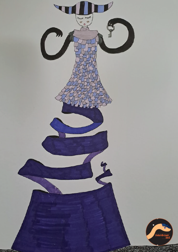
If you were particularly observant you might have noticed (though probably not) when I talked about my art a moment ago I talked of “drawing”. One thing I have realised lately is that… I don’t get paint. I have watched videos from a couple of youtubers about how to do digital painting and… I am just left with question marks. When I draw on paper (which I have been doing a lot lately since it is something I can do before bed which doesn’t involve a computer) I draw with a 2H pencil, then I use fineliners to outline and then I colour in with either pencil or marker. Much like my digital artwork I tend to go with big sections of bold colours. I like this style. Below is an example of one such (non-Illic picture I have worked on in the last couple of months).
This style is obviously much quicker than some highly detailed painting (digital or otherwise) and I feel like it expresses my desire for simplification. Perhaps simplification gives the wrong impression. The simplification is important but isn’t just any kind of simplification. I want to keep the essence of something while also making it simpler. I want to draw a small line that indicates depth or shadow rather than spending hours trying to recreate complex shadows. Another thing I like is to let the abstract bleed into my art a bit. The backgrounds with a sort of stain-glass window effect are an example of this. I like to think this will really give a fantastical feeling to my art. Yet if there was one thing I noticed at AVcon was… for the most part people didn’t get it. I heard my art was flat or that it was good as a placeholder. The people who did seem to be drawn to it were in fact small children who seemed to love the colours. One person in particular had an interesting take which was that my art was too smooth to match the voxel models in the game. To me this seems pretty backwards. The 2D art is something I carefully crafted for the game - whereas the voxels are an intelligent compromise. I simply do not currently possess the time or talent to make models that match my 2D artwork. So I made the voxel models so I can actually have models of my characters. Which in turn is to cover for me not being able to draw effects or make 2D animation.
What is my takeaway from this? There is a very simple answer. My technical skill is not up to par to execute my vision just yet. I need to spend more time practising my art so I can bring my drawings a bit closer to reality. Being able to add some impression of lighting to my drawings and by making my characters a bit more unique I can hopefully cross this barrier. As I mentioned in one of my recent blog entries, the test for art is for people to see it. So I have to get opportunities to get people’s reactions to my art so I can figure out what works and what doesn’t. That said, I won't worry about it too much. Lords of Illic is my hobby, it is a way for me to express myself and fulfil my creative urges. So long as I like the art to produce I have already lived up to my hopes and dreams. This is not to negate other people’s opinions though - it is to put them into perspective. You can’t please everyone and not everyone will get what your game or art is about. When I think about it that way it isn’t so scary for someone else to see my game. As for listening to their feedback - even if I don’t agree I will try to puzzle out why they would think that way.
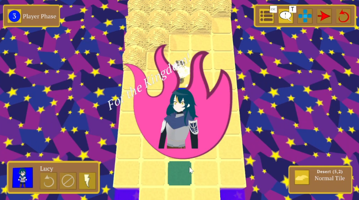
Getting back to Lords of Illic, the next character to get a design overhaul is… Lucy! I have considered renaming her to Lucretia but I think it is best for my own sanity to avoid that. Perhaps Lucretia can be her real name and Lucy is more of a nickname? I remember as a child I had a problem differentiating ls and rs so maybe the prince had some trouble too? Lucy might have been an easy name for him to say. That aside, another piece of advice I got at Avcon was making a character’s design reflect more of who they are in a battle. Lucy is a front line fighter so I am hoping her armour might reflect that a bit better. At the same time I hope her armour looks light enough to not give the impression that she excels at counter-attacking (maybe I am thinking too hard about it). Otherwise I wanted to show her having some ornamentation since she is not just a soldier but a protector of royalty. Finally I realised something as I looked at Lucy’s model / chibi icon and full sprite. The three didn’t match! This whole time the chibi and the model have had the wrong hair colour! None which was helping her to not look like a certain 3ds era fire emblem character.
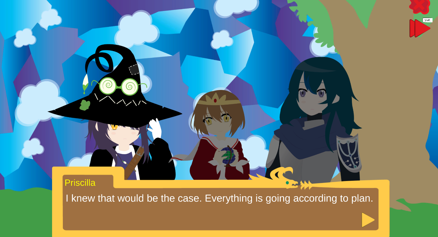
Wait a second, that is actually a picture of Priscilla with her new hat design! She is another character who I decided looked too similar to another character - in this case a certain explosion loving character. There are some more similarities in how she is introduced into the game but... actually if you look closely you will see that Priscilla is actually paint themed - that is because she was originally designed to be the protagonist of Poppy saves Paintland, my second year student project. We went with what I would say is a much more mainstream design. I like Priscilla's design better but I think Poppy works better in Paintland and Priscilla in Illic.
Now I have pushed the changes to appearance in the game, I can wipe my brow and sigh. I now need to update the Lords of Illic banner, trailer and probably some sample images somewhere. Oh well I think I will wait to update any images until I finish updating the art of other characters. I plan to push the next patch when I am finished with the first version of the ability charge changes, so see you next time.
Leave a comment
Log in with itch.io to leave a comment.